How to use Styled Components and why to use styled components?


In this blog, we will answer two questions about how and why to use Styled components to style react components.
Installation
To install styled components use the following command
  npm
  npm install styled-components

  yarn
  yarn add styled-components
Now we're ready to go, so let's style our first <h1> component with the classic Hello World.
What is Styled Components
Styled-Components is a library that allows you to write CSS styling in JavaScript using tagged template literals to style your components.
To use styled components, we need to import them into the component where we need to use them.
import styled from 'styled-components'
Use the above code to import styled components into the corresponding components where we need to import them and then export them to your need.
For example, I'm importing the styled component to my App.JSX file.
// This is my App.JSX file

// Import styled components
import styled from 'styled-components'

// Let's create a Title component that'll render an <h1> tag with some styles

const Title = styled.h1`
    font-size:2rem;
    color:#222A68;
    text-align:center;
    font-family:'Roboto',sans-serif;
`

// Now we'll use the Title component to wrap the react component with styles

function App(){
    return (
        <Title>Hello World</Title>
    )
}
In the above code, I've created a custom component to style my React component and named my styled component <Title>.
I've added the required CSS styles and used them to wrap my react component.
Let's use a styled-components to make a button next. The method we used is the same.
Make a custom component and give it a name of your choosing. As we are using React, we must adhere to the React convention. For example, the Title, Button, Header, and Main are some examples of custom names that should always begin with uppercase letters.
My component will be called Btn, and I will give it some CSS styles.
Wrap them to the React component to make a button.
// Create a custom component named Btn that'll render a Button with some styles to it

const Btn = styled.button`
      font-size: 1em;
      margin: 1em;
      padding: 0.25em 1em;
      border: 2px solid #BF4F74;
      border-radius: 3px;
`

// Now lets use the Btn component

function App() {
return (
    <Btn>Next</Btn>
)
}
Results
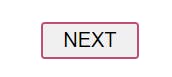
As you can see, we have created our Button element using styled components.
Why use styled-components
Styled components are built to enhance the styling of CSS, and as you know, the process of CSS at times can be overwhelming.
You don't need to think of className again for every component as styled components generate unique className for the styles.
It can be hard to know whether a class name is used somewhere in your codebase. styled-components makes it obvious, as every bit of styling is tied to a specific component. If the component is unused (which tooling can detect) and gets deleted, all its styles get deleted with it.